


“I’m a ‘Recovering Minimalist’ – This is How I Finally Let Color Into My Home”
Writer Lauren Caruso proves that even the most color-averse decorators can break away from the all-white aesthetic.
After five years in LA – where I’d grown used to the luxury of an extra bedroom, an extra bathroom, a balcony, even a sauna – I gave it all up to move back to New York this winter. And despite it being the coldest, snowiest winter the city has seen in over a decade, I’ve never been happier to be back.
I’ve always described my personal style, both in fashion and interiors, as minimalist – bordering on color-averse. But somewhere between scrolling late-night Marketplace listings and mentally furnishing apartments I didn’t yet have, I noticed a shift. My saved folder was no longer filled with mid-century neutrals, but French provincial pieces with curves, patina, and just enough personality to feel like a risk. Once I bought a pair of antique pewter wall sconces, I accepted that my apartment might not feel “cohesive” in the traditional sense – but it would feel like me: pared-back, personal, and a little less afraid of color.
The search itself was exhaustive. I saw no fewer than 50 apartments over six months. I needed something that felt grounding enough to live in solo (my partner splits time with LA), but exciting enough to mark a new chapter. I landed on a less-than-charming new build: a big white box with 1.5 bedrooms and one bathroom, directly across the street from my best friend. A blank slate, in every sense, and I figured I could bring the charm myself. Maybe that’s why color finally felt possible.

The bathroom
In my last three apartments, I’d flirted with the idea of painting the bathroom only to abandon it each time in a spiral of indecision. This time, I committed immediately.
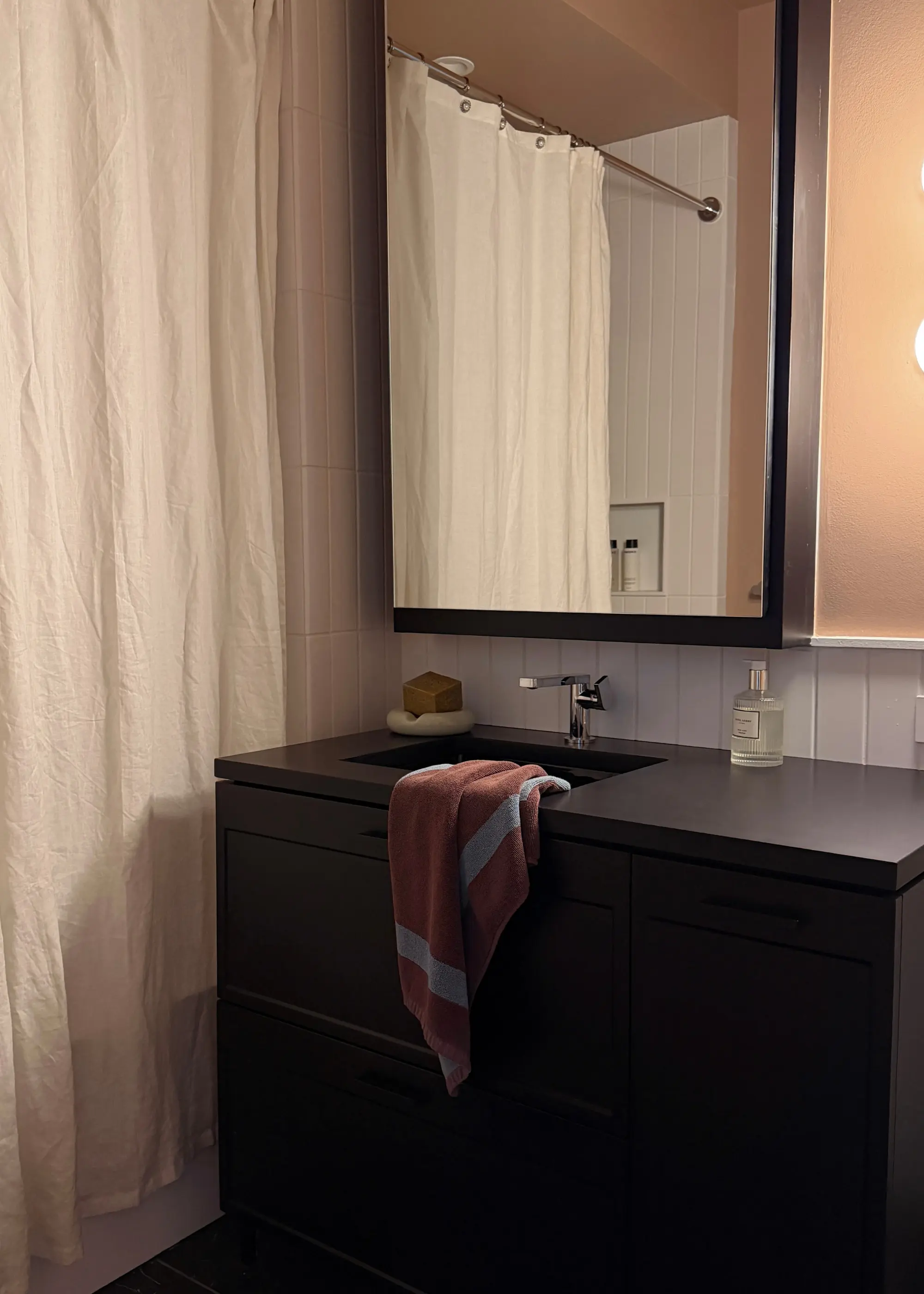
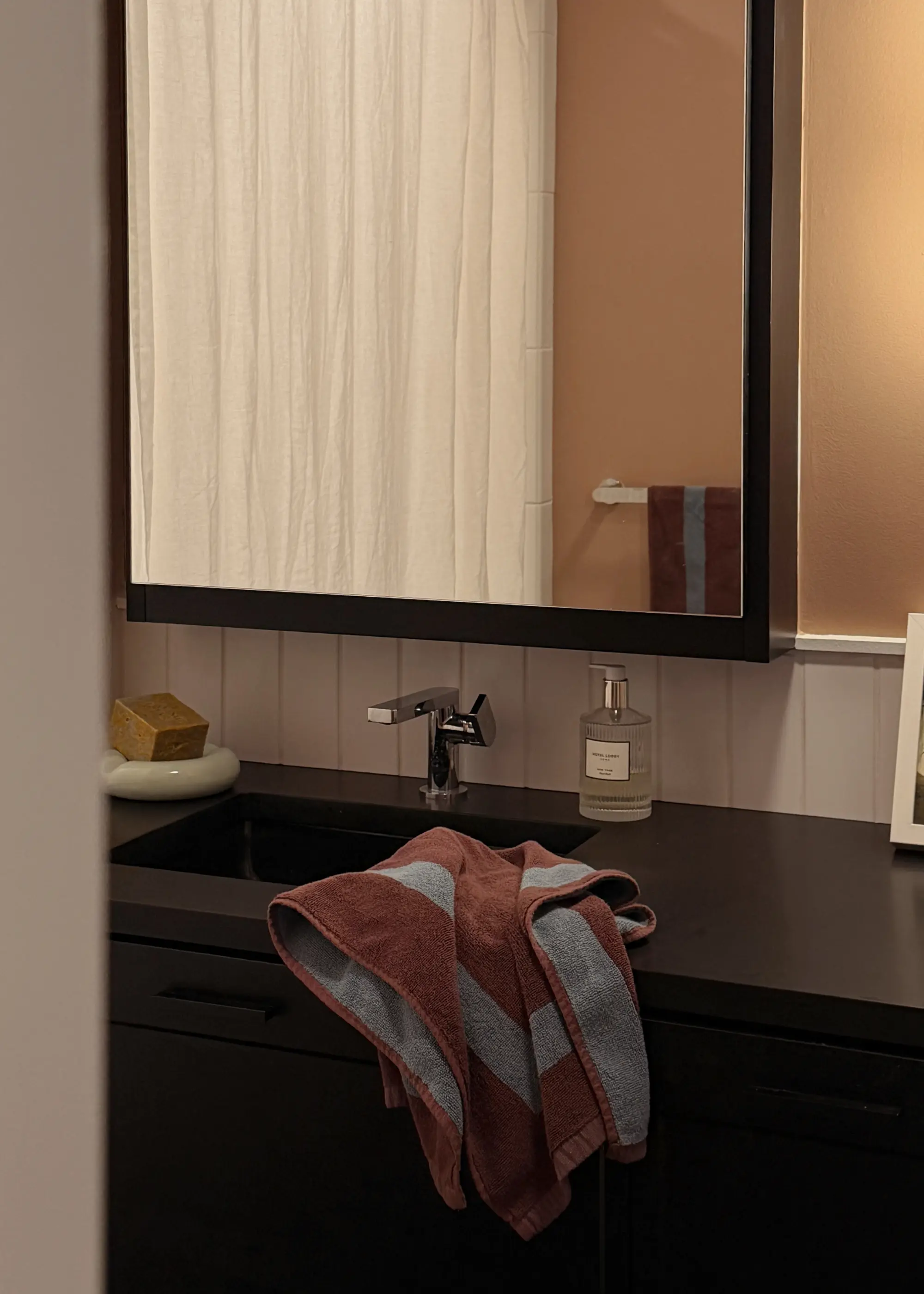
I thought I’d land on something grounded like Ghost Ranch, a warm terracotta from Backdrop, but after a few days of sitting with samples, I found myself drawn to something softer. I ultimately chose Studio Hours, a muted, warm taupe that reads unmistakably pink in certain light. When I first opened the can, I was convinced I’d regret it. Three months later, it’s my favorite room in the apartment.
Bathrooms are notoriously tricky – so much tile, so little wall – but even a small amount of color goes a long way. That’s something I didn’t fully understand before: color doesn’t have to be overwhelming to be effective. In fact, it’s often better when it’s not. The real turning point, though, was textiles.


I’ve always loved the idea of pink and brown together – something about it feels nostalgic, a little ’70s, a little inherited – but what surprised me was how much I loved brown and blue. The Cacao & Lagoon Two-Toned Bath Towels introduced just enough contrast to keep the room from feeling overly sweet. Plush but not overly bulky, they’re the kind of towels that make your bathroom feel considered, even if the rest of the space is still evolving.
More importantly, they’re reversible – which means the palette shifts depending on how you hang them. It’s a small detail, but one that makes the room feel dynamic without requiring any real commitment.
That’s become my general philosophy with color: when I’m hesitant, I start with pieces I can change, like towels, bath mats, even a soap dish or tray. They’re low-stakes, high-impact, and they let me experiment without the permanence (or pressure) of paint or tile.

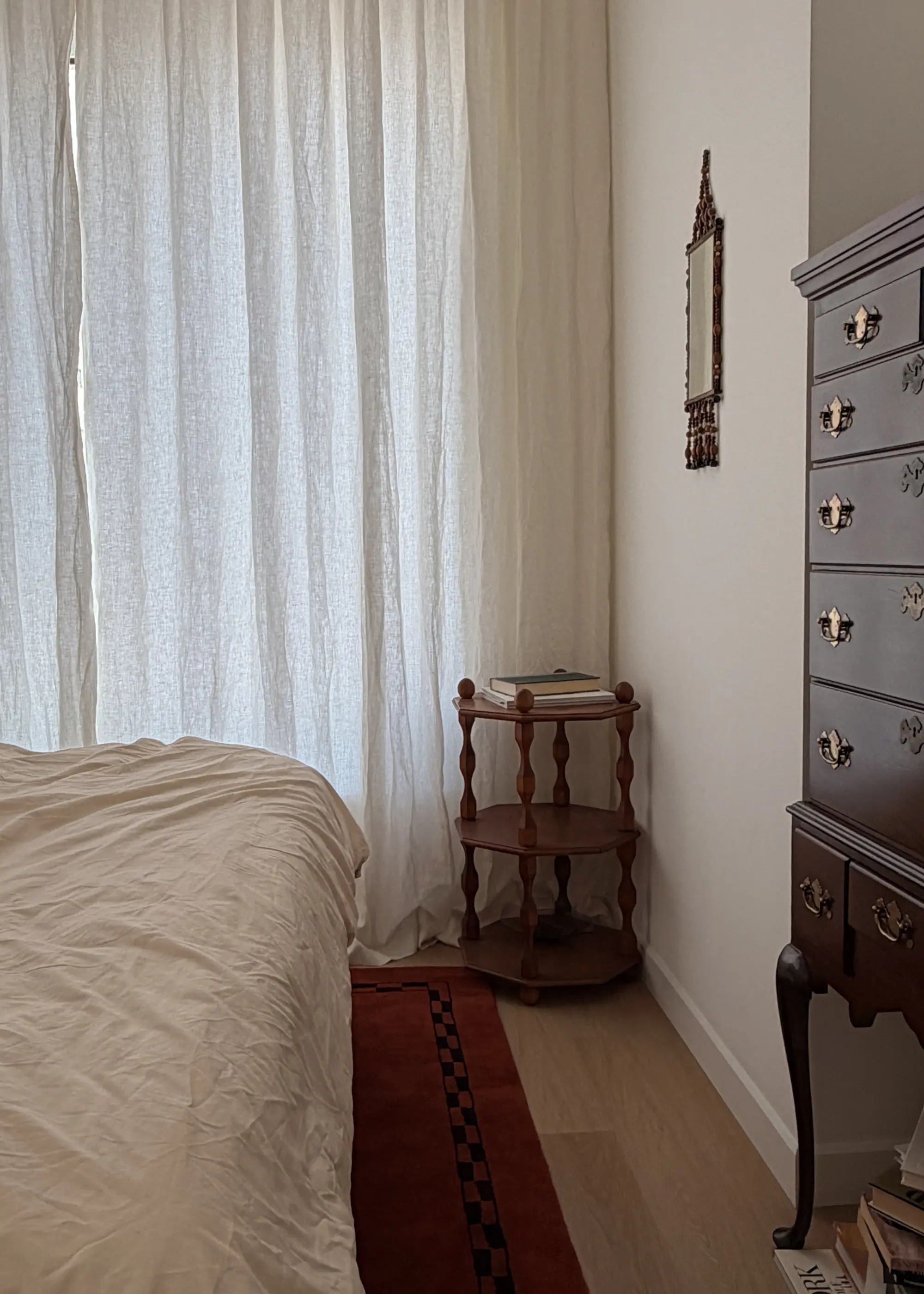
The bedroom
The bedroom is still a work in progress, but in many ways it tells the more honest story.
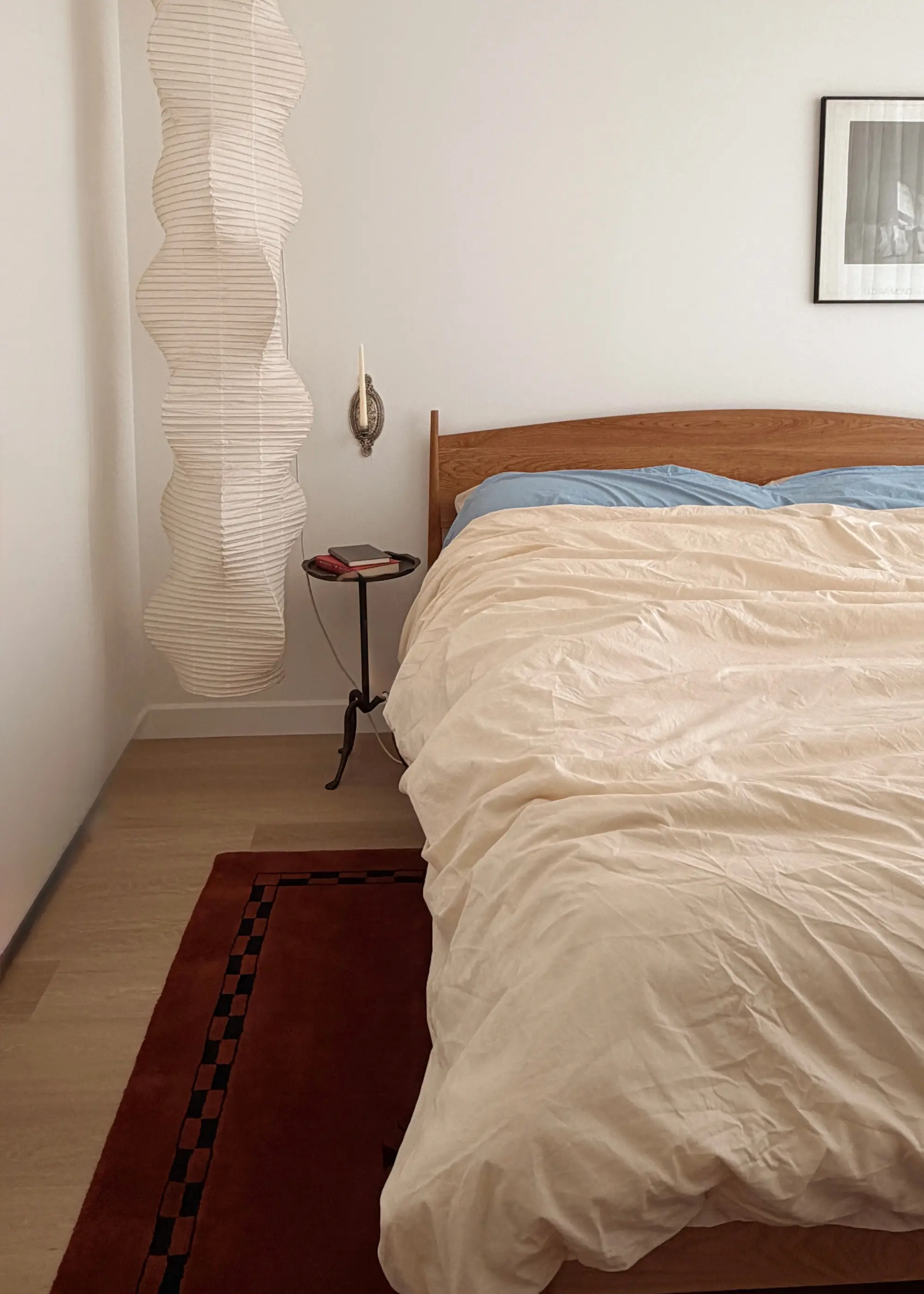
When I first toured the apartment, I envisioned an all-white oasis – something clean, quiet, and predictable. But between delayed decisions and unexpectedly fast furniture deliveries (shout-out to Roseland, a family-run furniture business that makes my bed) the space stayed white. And while part of me still wonders what it would’ve looked like painted a soft, earthy beige, I’ve come to appreciate the restraint. As it turns out, you don’t actually need to paint a room to make it feel like it has color.
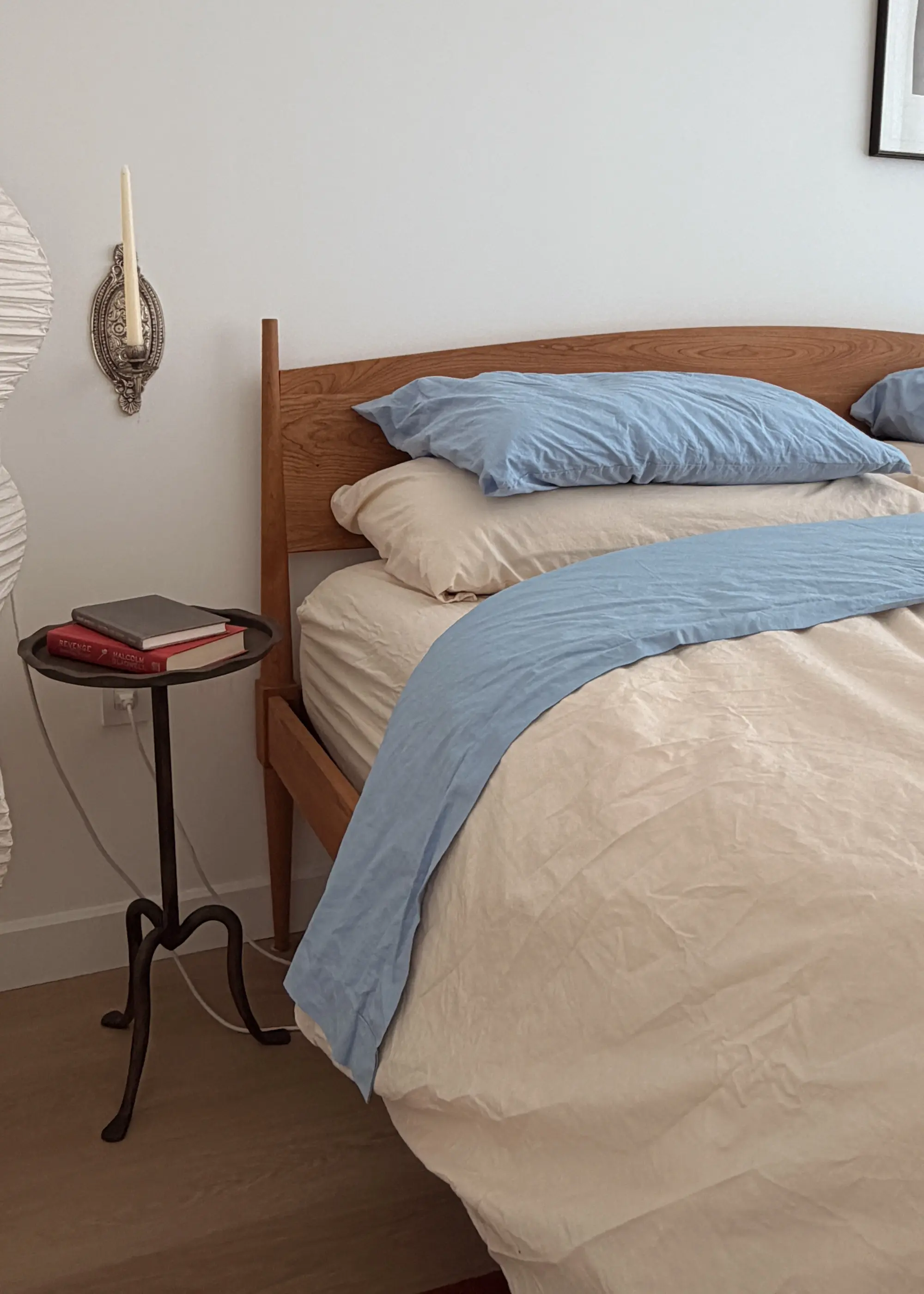
For me, it started with bedding. If you’re someone who’s historically avoided color, bedding is one of the easiest entry points. It’s something you interact with daily, but it’s also something you can swap out seasonally (or even just when you’re bored). A different set of pillowcases can shift the entire mood of the room.
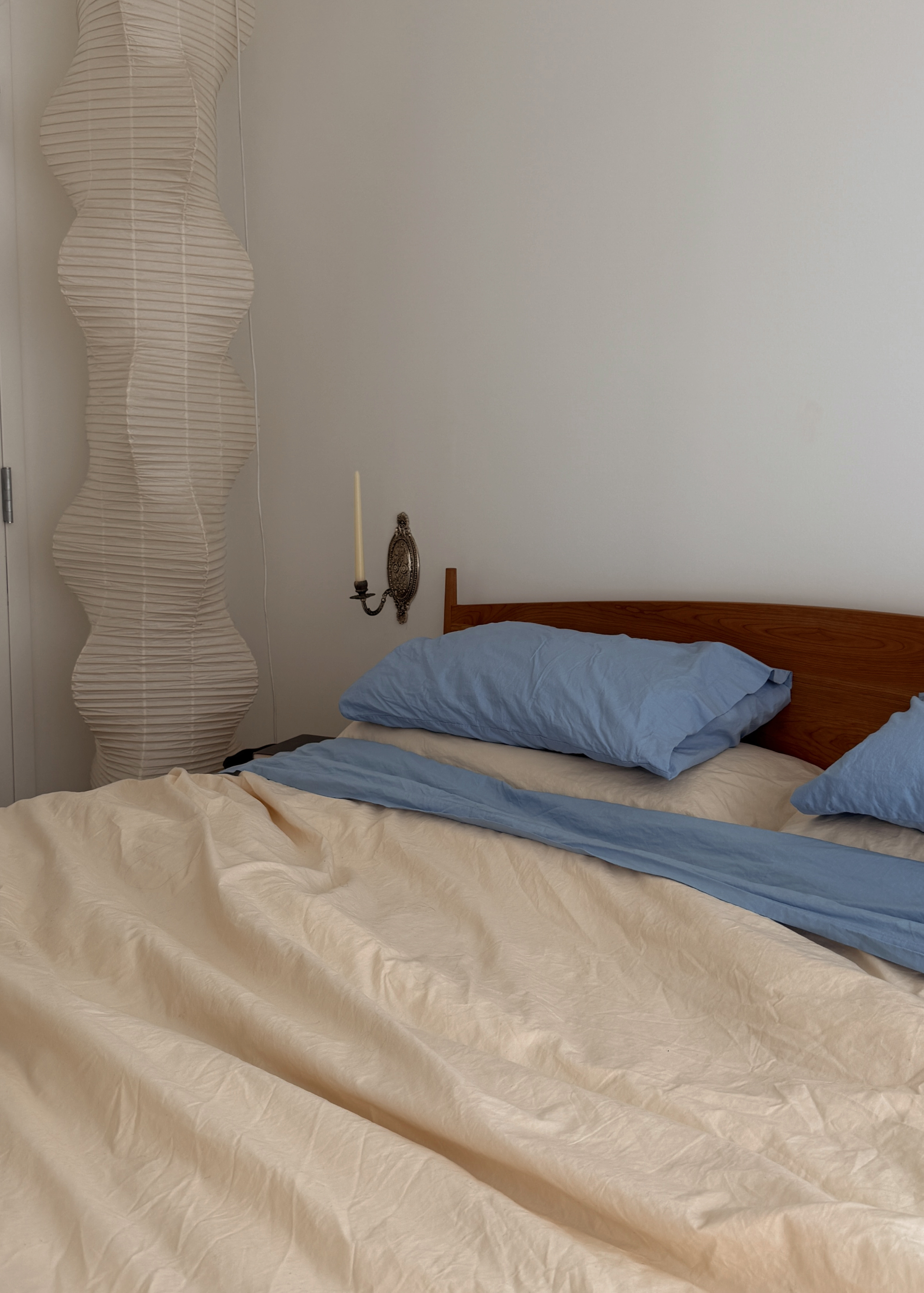


I chose the Vanilla & Sky Build Your Own Bedding Bundle in organic cotton percale – crisp, breathable, and just structured enough to make the bed feel intentional, even when it’s not perfectly made. The palette is subtle: a soft sky blue paired with a creamy, almost peach-toned neutral. It’s the kind of colour combination that reads as neutral from a distance, especially when the blue peeks out just so. I thought I’d swap out the blue pillows if it started feeling like too much colour, but it never did.
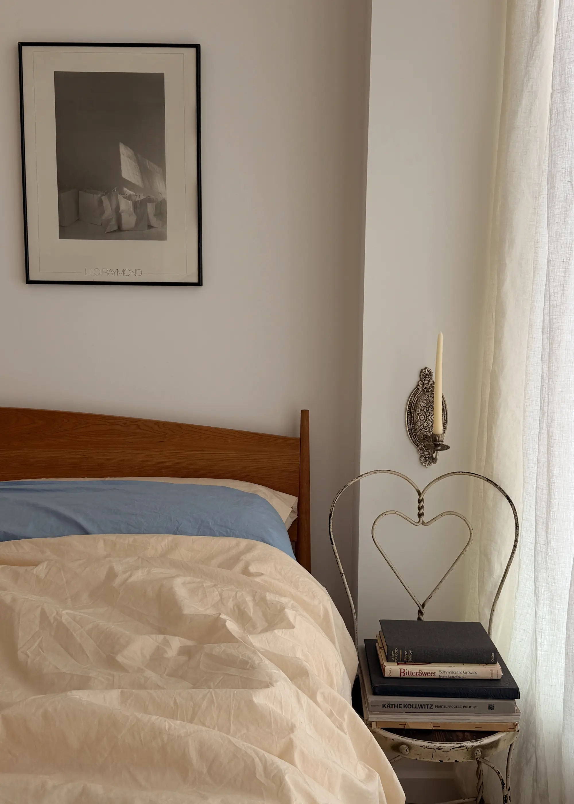
I kept the rest of the space relatively grounded: a wooden bed frame, warm-toned makeshift nightstands from two separate vintage stores, and a rug that, for the first time, isn’t black, white, or beige — but a deep burgundy that pulls warmth from the wood and adds just enough depth to make everything else feel more cohesive. It’s not a loud room, but it’s not devoid of colour, either.
The “After”
I wouldn’t call this a “maximalist” transformation – if anything it’s a study in restraint, or what happens when you introduce color in ways that don’t feel overwhelming. That said, color doesn’t have to be a full commitment: It can be a towel you swap out, or a set of sheets you rotate, or a rug you live with for a season and then move to another room.
For years, I thought being a minimalist meant saying no to color entirely. Now I understand it’s more about being selective, choosing tones that feel like me and letting them show up in ways that are easy to live with.
This apartment may still be a white box at its core, but it feels warmer, more personal, and, yes – more colorful than anything I’ve lived in before.
Enjoyed This?
Discover more tips for embracing minimalism.


