How Designer Sarah Shinners Turned a 'Beige' Rental Into a Maximalist Haven
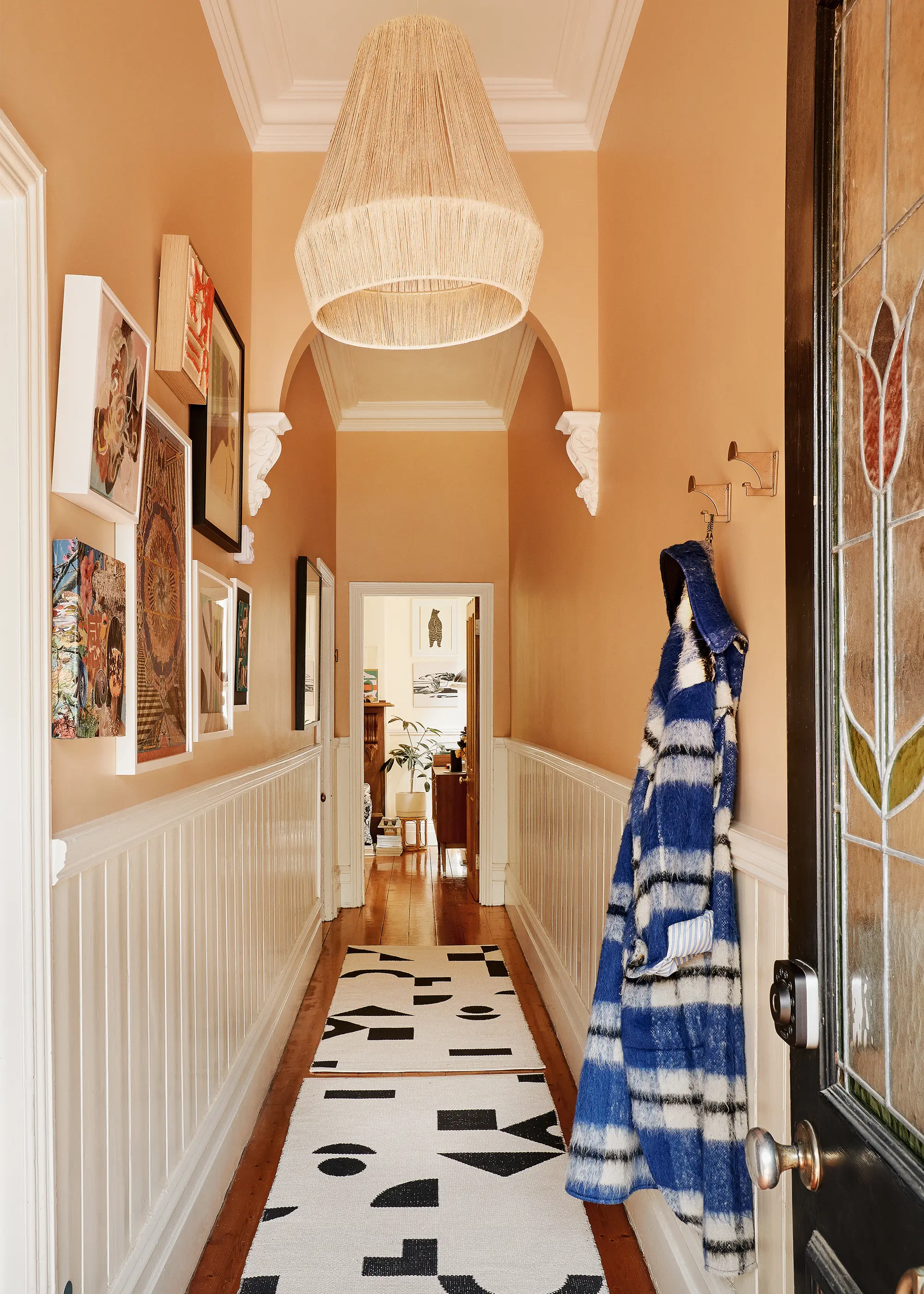
Over the past eight years, the Melbourne home has undergone a transformation into a bold, homely, and layered space.
Welcome to The Makers. Each week, we celebrate innovators, artisans, and crafters of all types by taking you on a private tour of their creative spaces. For this instalment, we tour interior designer Sarah Shinners' boldly decorated rental home in Melbourne's Clifton Hill.
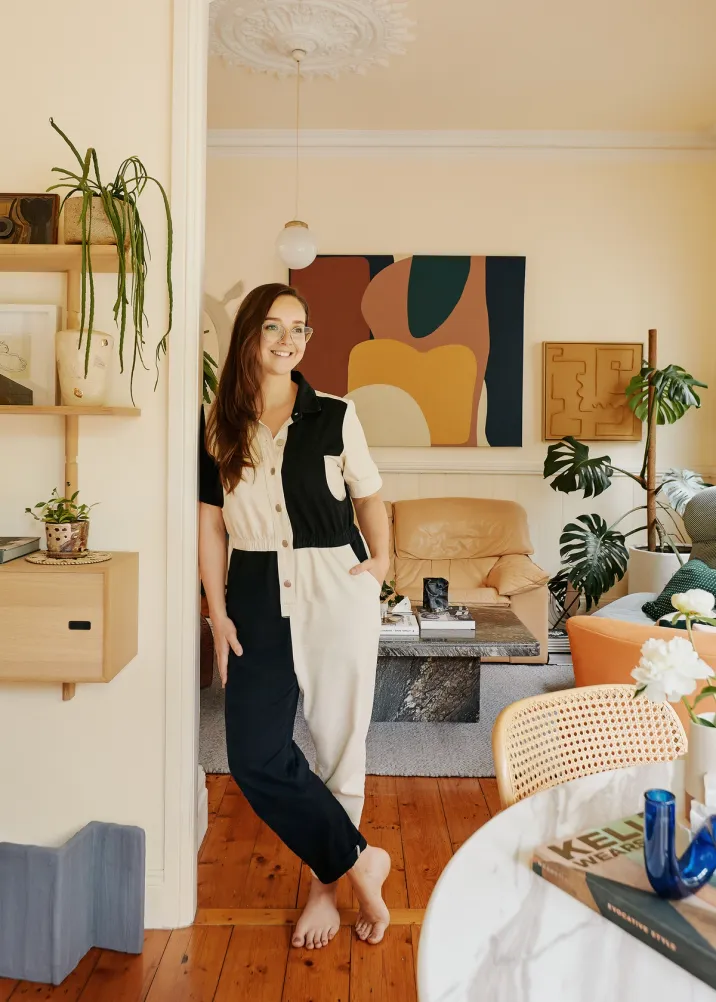
As the Design Manager at renowned studio Simone Haag, it's unsurprising that interior designer Sarah Shinners has a beautifully decorated home herself. The creative spends her days working alongside the award-winning team to furnish and style high-end residential homes for a roster of enviable clients and comes home to an artfully decorated abode in Melbourne's Clifton Hill. But her journey to this position as a full-time interior designer and stylist follows a slightly different path than most.
Sarah wasn’t encouraged in high school to pursue a career in the creative arts and instead went on to undertake a Bachelor of Prosthetics and Orthotics at university. She worked for six years in this field before deciding to live out her passion as a designer, pivoting from full-time work at the hospital to part-time work and study at Mercer School of Interior Design.
And while a shift in careers can be daunting and leave one feeling as though they’ve lost time, Sarah believes this training has better equipped her to deal with the stresses that can come with being a full-time interior designer. “Having dealt with patients who are in need of spinal care, often related to serious trauma, it helps put my work into perspective,” she shares with Bed Threads Journal. She also utilizes the plaster skills she learnt to create custom plaster artworks and mirrors, both of which hang in her home.

As you’d expect, Sarah's abode is beautifully decorated with unique and interesting furniture and objet d’art. “I furnish with my heart," she says. "I’m strongly drawn to colors and have collected pieces over a lifetime of travel."
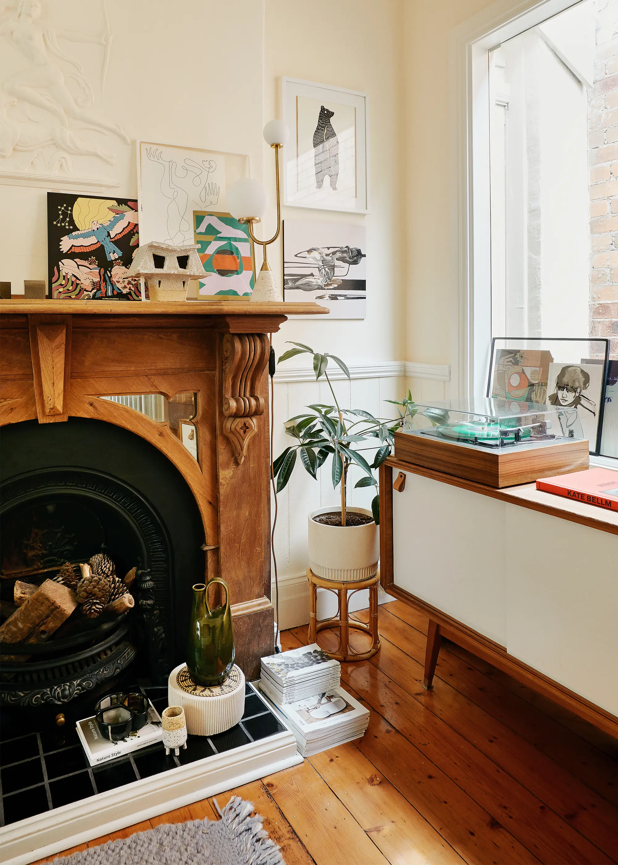
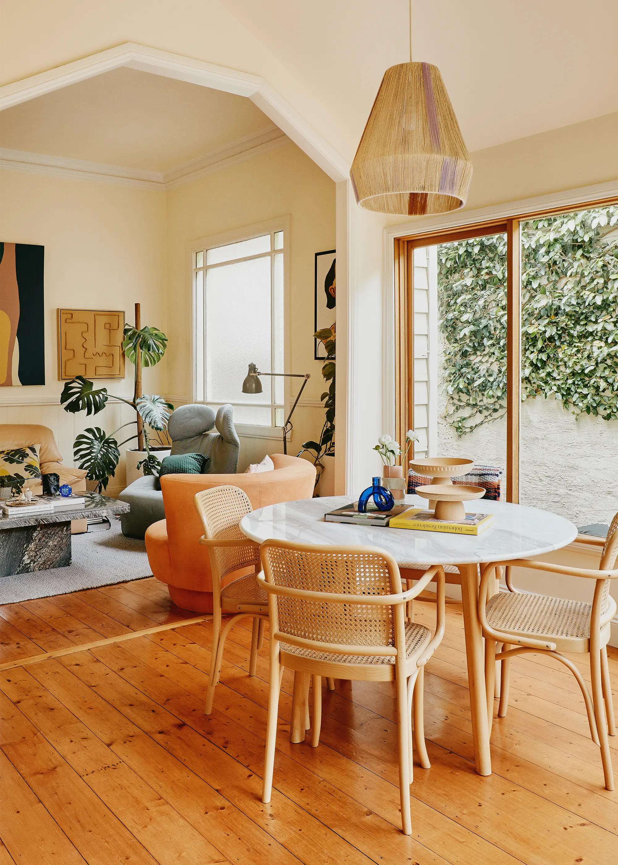
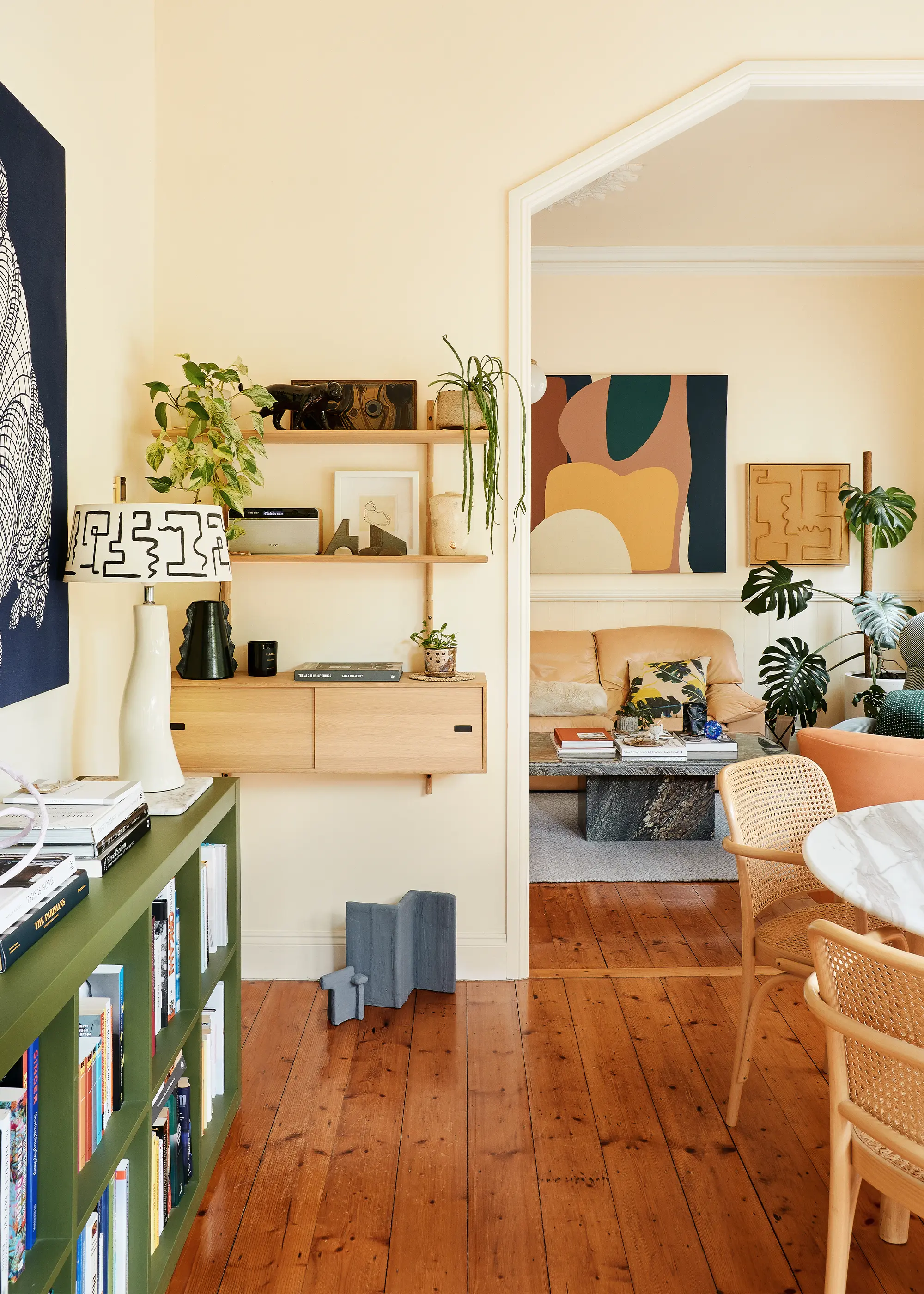
Upon inspection, the house had plenty of potential with its charming Victorian details like vaulted ceilings with ceiling roses. However, the interior design process didn’t come without its challenges. A renovation in the 1980s resulted in the space having a unique layout that was tricky to work with, and being a rental property meant there were limitations with what could be done. But as is her job, Sarah expertly implemented interior design solutions to improve the home, including selecting furniture that helped open up the space to make it feel larger.
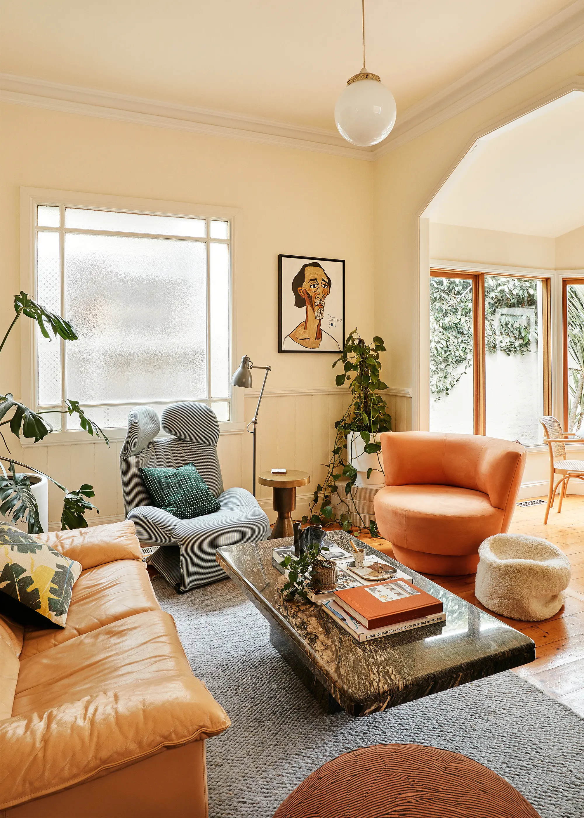
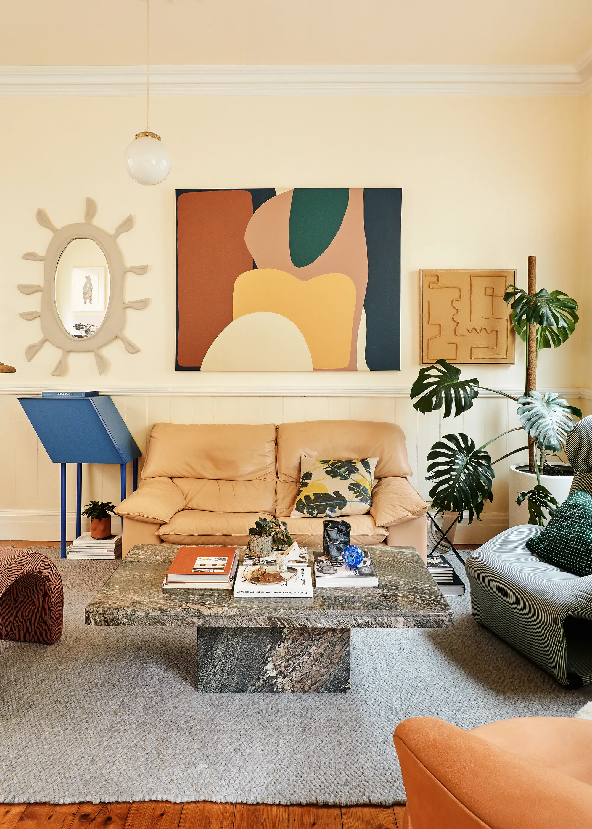
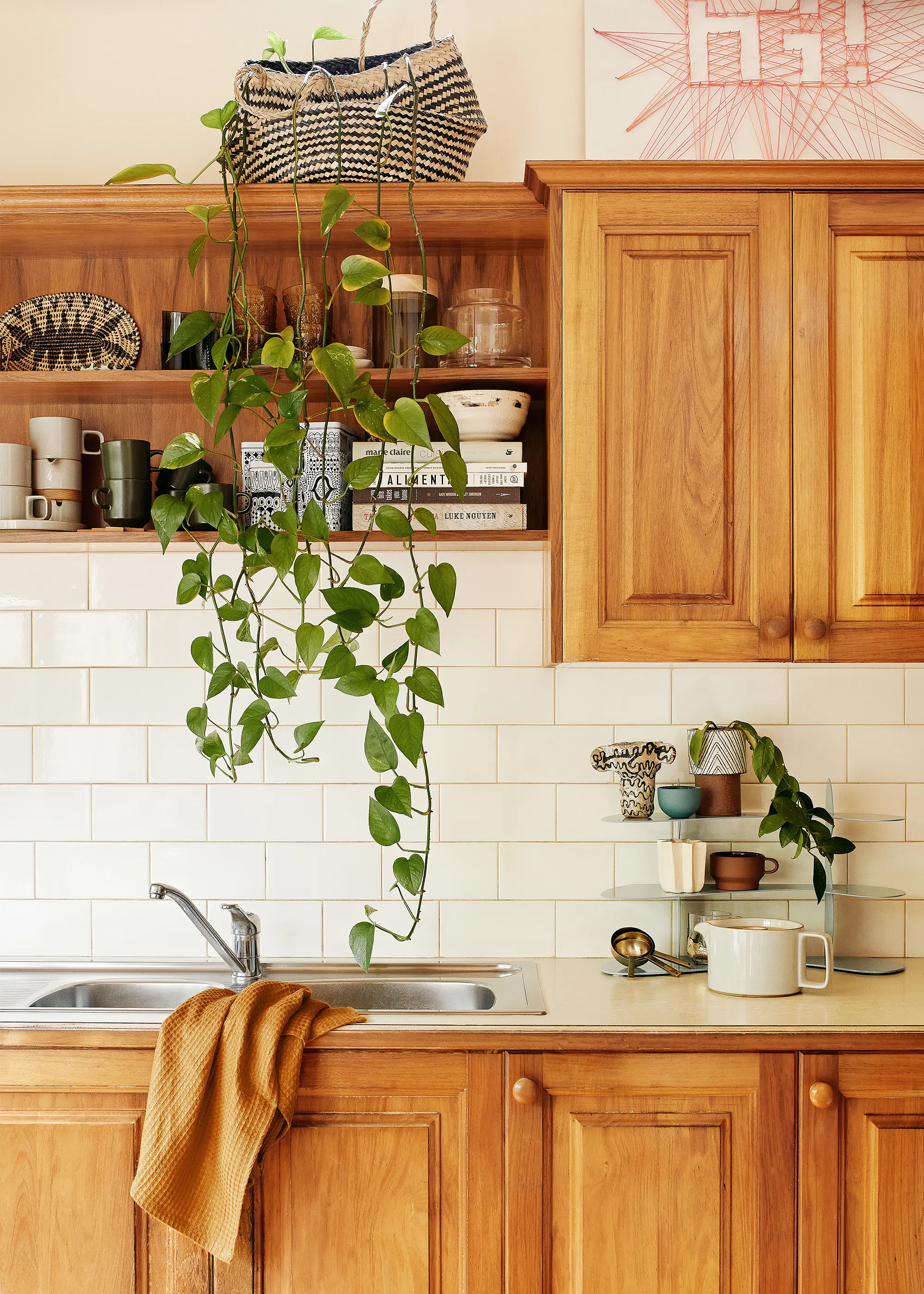
The interior scheme is maximalist yet refined. A range of graphic artworks adorn the walls and lashings of varying hues are showcased throughout the home. In the living area, a variety of seating designs makes the space feel interesting and playful, as do the unique selection of décor collected while travelling. "I see my home as an experimental space where prototypes are trialled, personal creative endeavours are displayed, and items researched during daily work are distilled to create a place that is bold, homely, and layered," she says.
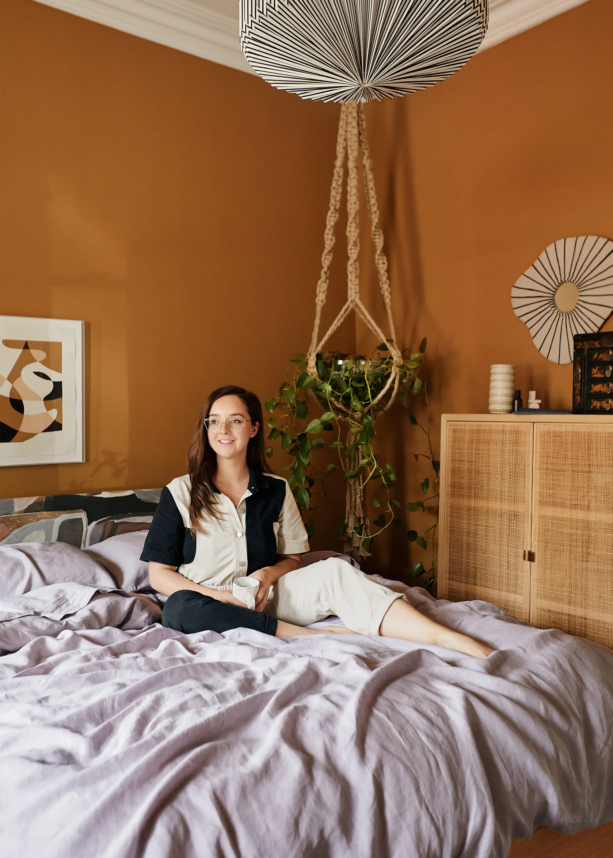
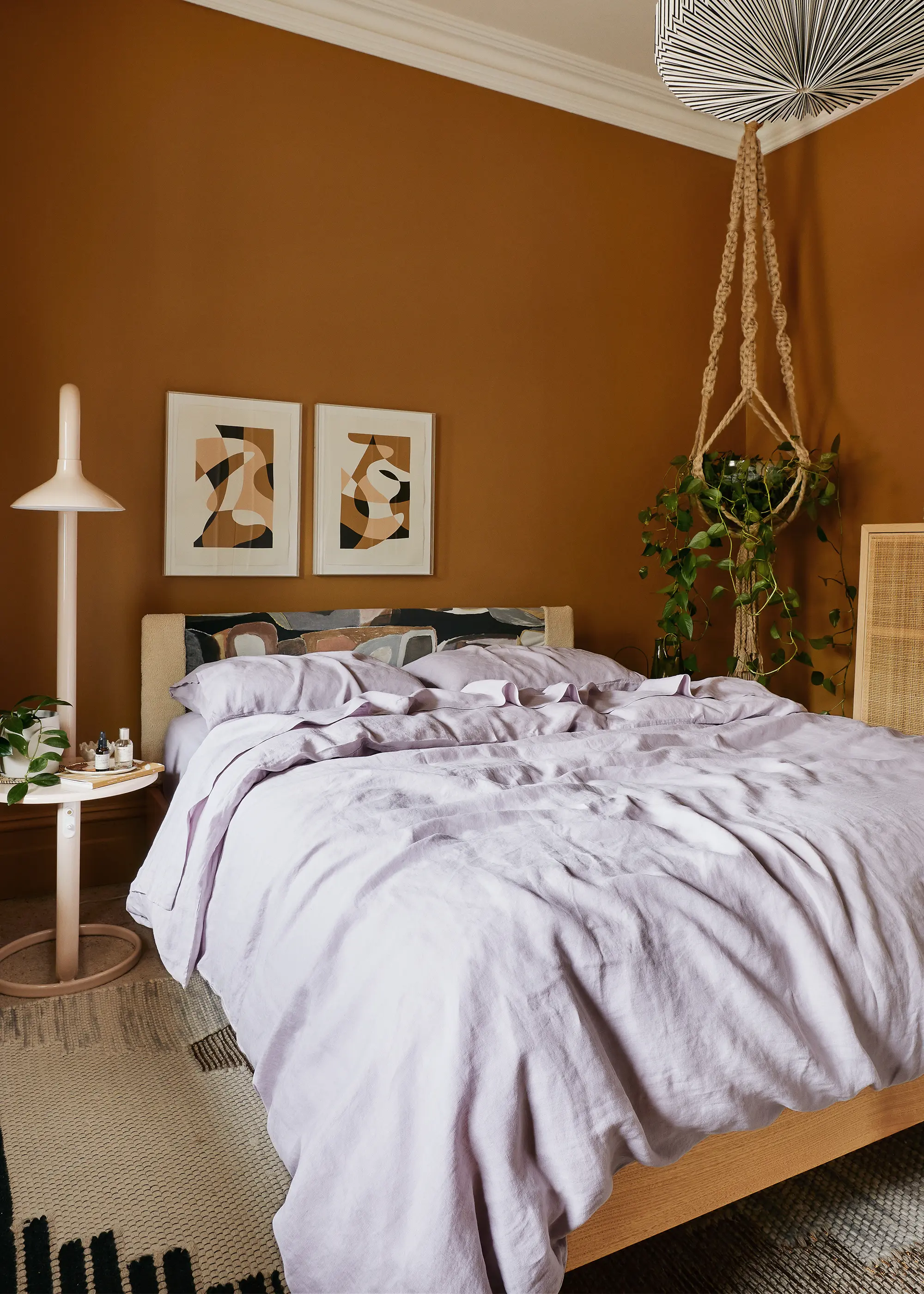
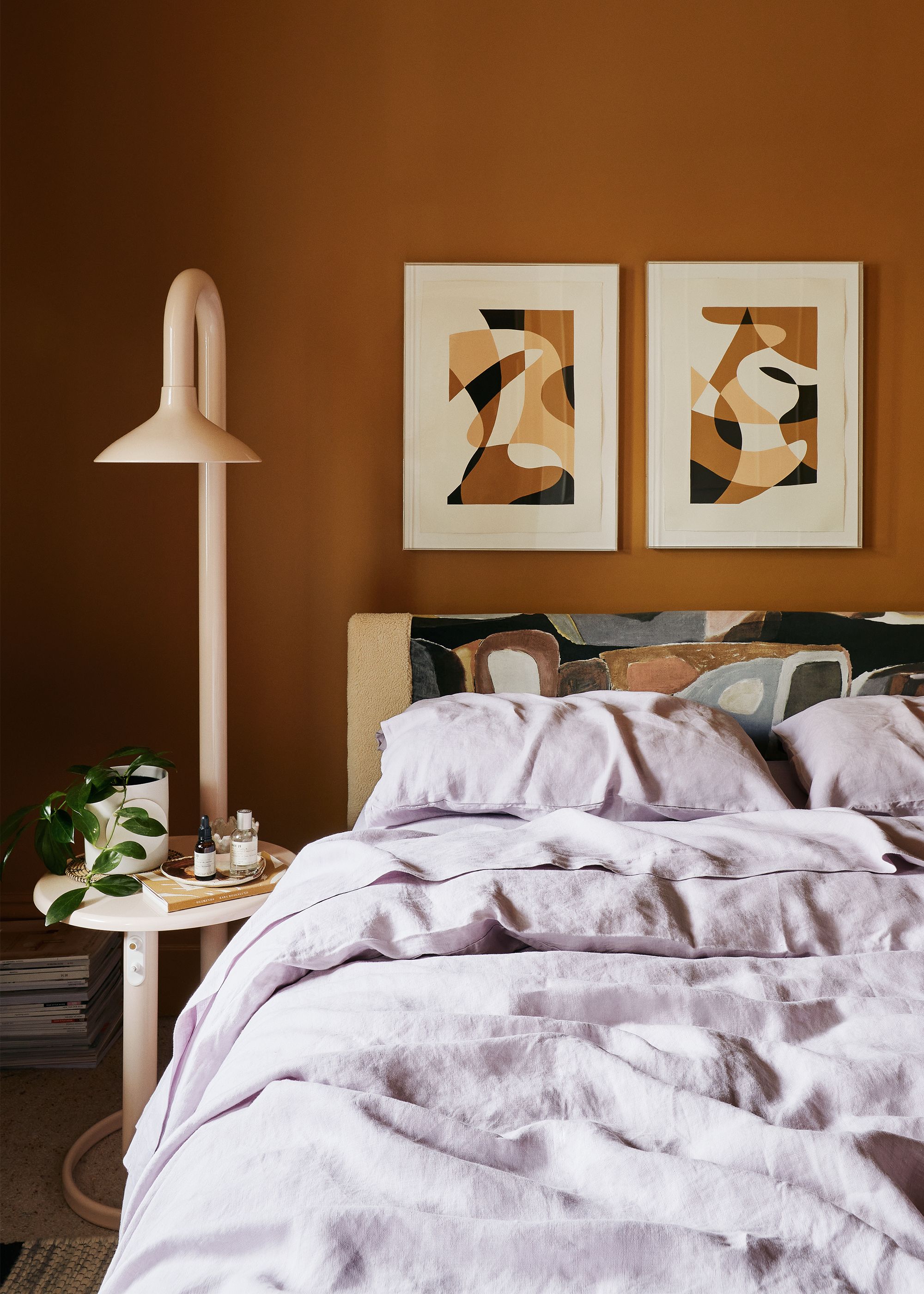
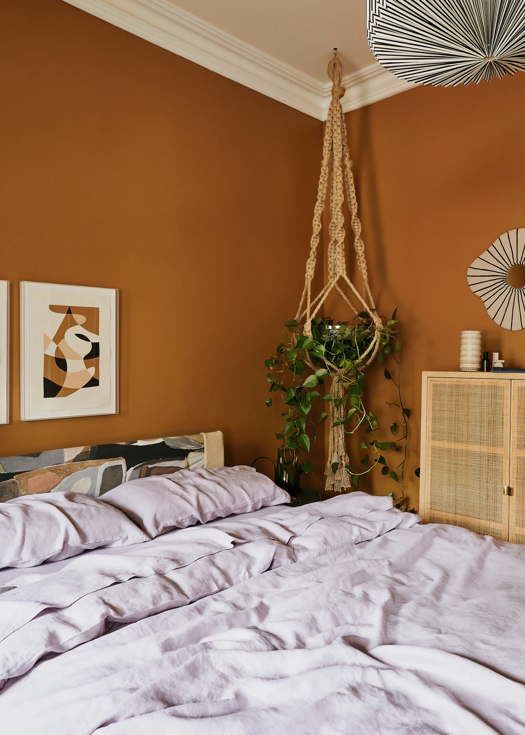
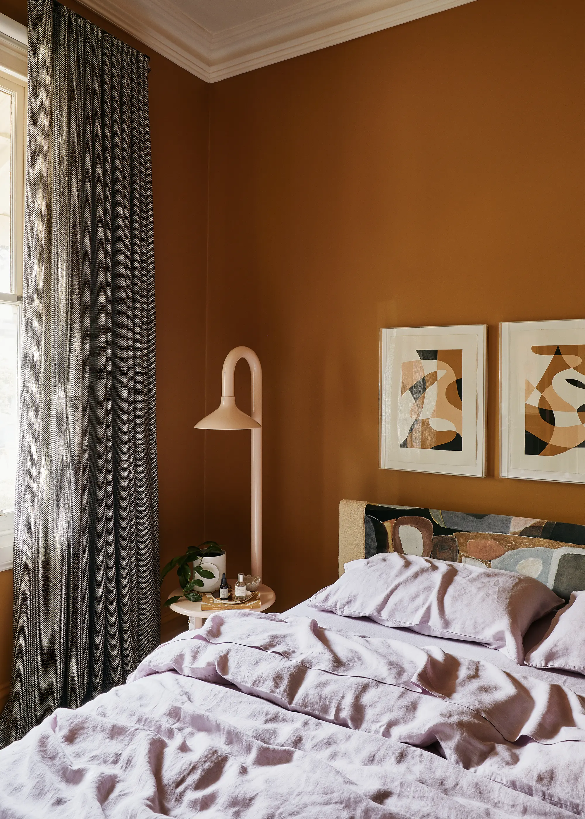
The walls of the primary bedroom are swathed in a warm gold hue which makes the space feel cozy and cocooning. This is beautifully offset by Lilac linen which injects further color into the space and a fresh touch.
We spoke to Sarah about her top tips for a well-styled home, the decorating details within, and how she made the switch to a career in interior design.
Hi Sarah! This series is called The Makers. What is it that you make?
Hi! I’m the Design Manager at studio Simone Haag where I work alongside the team to furnish and style high-end residential homes. I also create custom plaster artworks and mirrors.
How does the act of “making” relate to your personality and who you are?
Making has always felt very intuitive to me. I see it as meditative, relaxing, and essential to have a creative outlet in my life. Even since flipping my career to interior design, I still feel a strong pull toward creating physical pieces, even if just for myself and my friends.
Tell us about your career journey to date. Did you always know you wanted to pursue this line of work?
My career journey has been far from straight and narrow. When I was finishing high school and tasked with making a decision on ‘what to do for the rest of my life’, creative courses were not highly encouraged and I was swayed towards a health degree: a Bachelor of Prosthetics and Orthotics to be specific. Graduating four years later, I went on to work in this field for six years, at The Princess Alexandra Hospital in Brisbane and The Alfred Hospital in Melbourne.
Although I met some amazing colleagues, friends, and even my husband as a Prosthetist/Orthotist and picked up some mad plaster skills, I needed to break out into a job I was truly passionate about. So I went back and studied at Mercer School of Interior Design whilst working part-time; I loved every minute of it and haven’t looked back since.
Before completing my design studies I reached out to Simone Haag at just the perfect moment. As Simone’s first hire, I became the studio’s Design Assistant and later Design Manager. Since then, both the business and my role have evolved dramatically, yet I still call on some technical skills from my past life from time to time. If anything needs any form of assembly on installation day, it lands in my pile without hesitation – I’m quite handy on the tools!
Talk us through your creative process. Where do you start?
From a design perspective, the process begins with the client; their brief, their loves and wishes, their unique style. From an art perspective, it’s very ad hoc. It’s based on feel, whatever comes naturally. Colors that I’m drawn to play a huge role in the direction the work takes. I also love to play with shape and repetition and let the work evolve as I work on it.
What’s been the most challenging lesson learnt so far in your career?
My role as an interior designer involves working with hefty budgets and emotions can run high when a piece of furniture comes later than scheduled or is damaged in transit. But I think my past experience as an allied health worker also helps me in terms of recognising a good day vs. a bad day. Having dealt with patients who are in need of spinal care, often related to serious trauma, it helps me to put my work into perspective.
What’s been the best thing that’s happened to you since you started your career?
Oh, tough question! There have been a lot of great experiences working for Simone Haag, but I’d have to say our trip to LA which we managed to squeeze in literally days before the pandemic hit. A visit to the Sheats-Goldstein house was pretty epic!
Do you have a single piece of advice you’d give to your younger self or someone looking to pursue a similar line of work?
In this industry (well in any industry really) directors and employers aren’t going to go looking for you, and they want you to make their life easier, not harder. So put yourself out there, work hard to get noticed, and keep learning and developing to ensure you’re always relevant. Simone always asks me to come to her with solutions, not problems. And that has been a great piece of advice.
Now, the home stuff. How long have you lived in your home?
We’ve lived in our home for almost 8 years now since we moved back to Melbourne from Brisbane.
How did you initially know this was the space for you?
We’d moved back from Brisbane to pursue further career opportunities and had settled back in with my family in the burbs temporarily while we were on the hunt for a rental closer to town. Originally, we attended a few inspections in the Brunswick area, but weren’t blown away by value for money (tiny boxes that wouldn’t fit our modest fridge or washing machine coming in at the high point of our budget).
Then one day we decided to explore a little further afield, taking a sunny Sunday drive along Scotchmer Street, through Carlton and Fitzroy North, landing at the main drag of Clifton Hill in Queens Parade. We were hooked on “the village” vibe and so immediately started looking for rentals in the area. My husband Pat came across this gem and went along to the highly contended open house (I missed it, cursing public transport all the way from work). When I finally arrived out the front, I was met by a smiling Pat who knew we’d found the one, but thought we had absolutely no chance of getting it amongst the hordes of other potential tenants! Turns out it was meant to be.
Clifton Hill is the ultimate family suburb on the cusp of the city. We’re literally a block from Smith Street, Collingwood, but our tiny street has a real sense of community and a quiet cul-de-sac vibe that we love. The home itself out-played all other rentals we looked at from a character perspective with its vaulted ceilings, Victorian details, and quirk factor. It was also painted (literally) in the one shade of beige throughout which, although initially tedious to live with for someone who loves colour, was the perfect neutral starting point.
Did you do any renovations or make any big changes after moving in?
Our home is a rental so we can only make cosmetic changes, however, we are lucky to have a very flexible landlord who we have openly discussed our aspirations with, and successfully negotiated things like extended lease periods so that we felt more secure in updating the property cosmetically. We offered to split the cost (as we did for our curtains) or cover the cost (as we did for painting) of works to make them more viable for the landlord and ourselves.
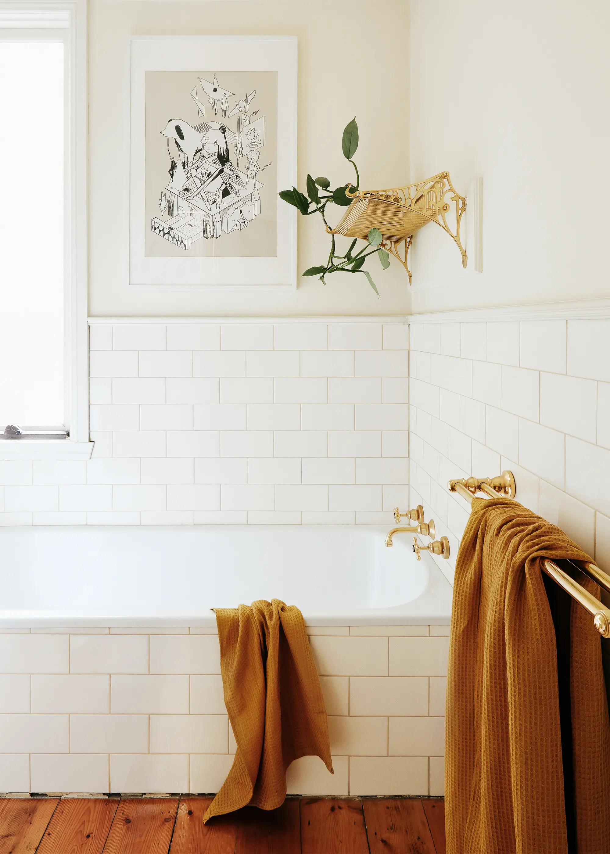
Changes have been made slowly over the past eight years, the most significant being the repainting of the bedrooms, hallway, and bathroom. But we haven’t done any major renovations, which I feel highlights the power of interior decoration.
What was the thought process behind the way you’ve styled the interior?
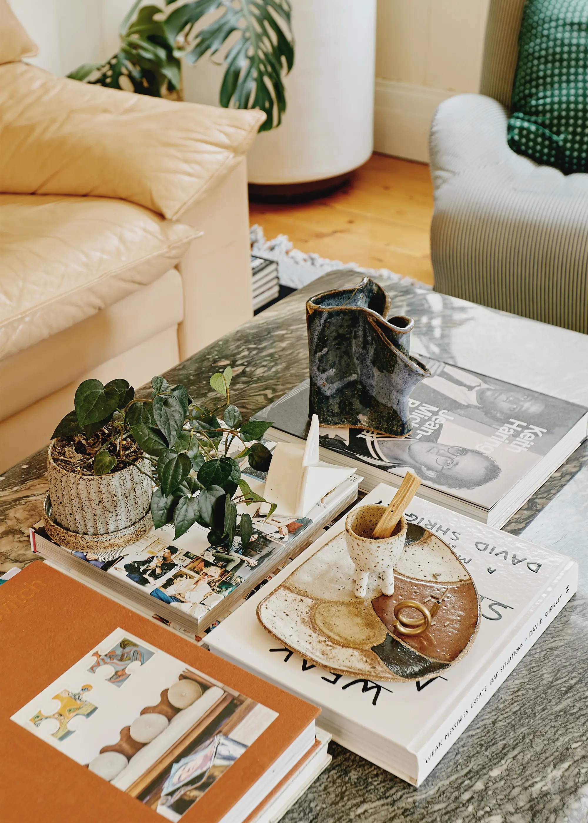
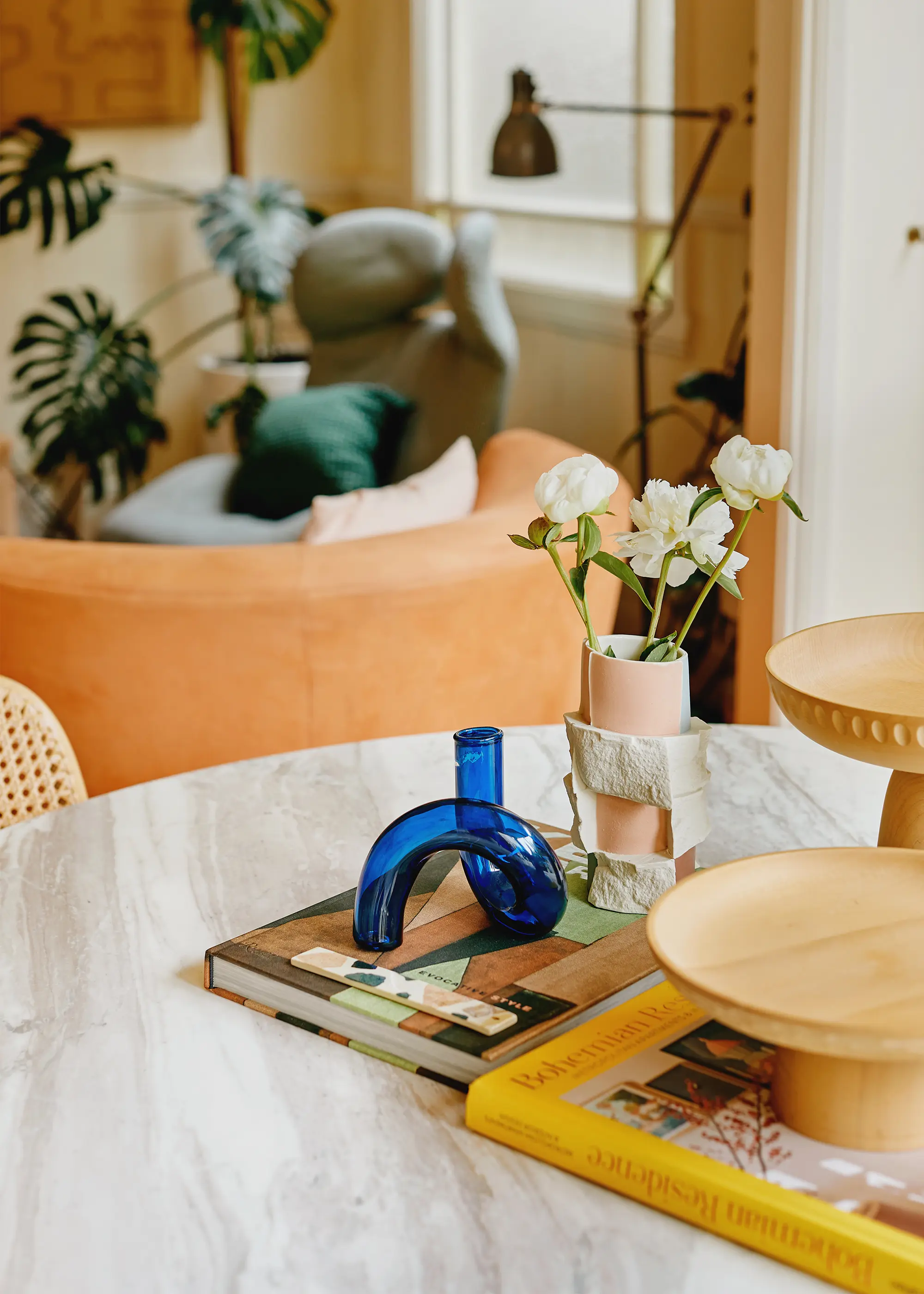
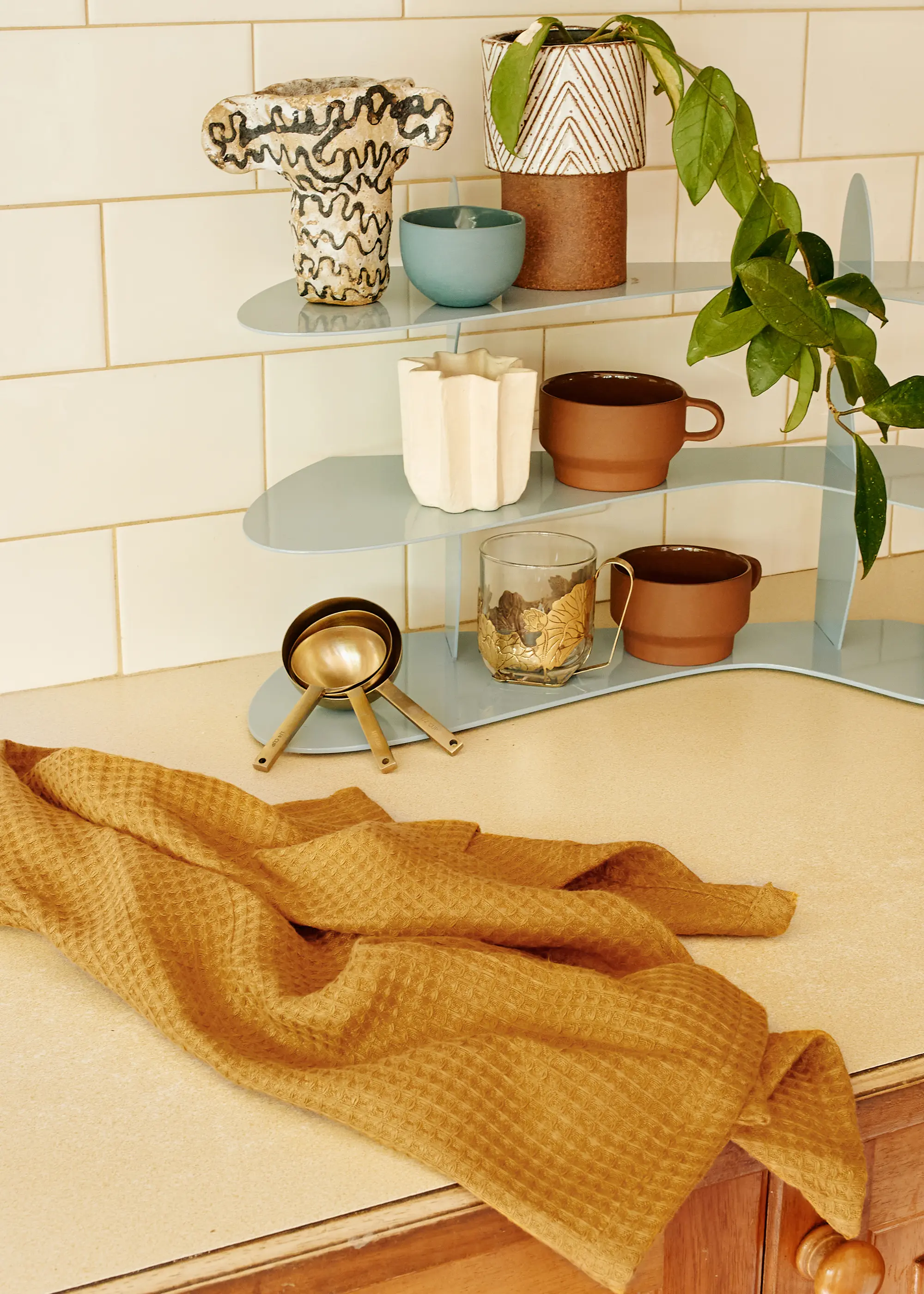
Ever the maximalist, my home is a melting pot of art and objects both created and collected over many years; a daily reminder of times travelling, trawling op shops and markets and stores around the world. I see my home as an experimental space where prototypes are trialled, personal creative endeavours are displayed, and items researched during daily work are distilled to create a place that is bold, homely, and layered.
Our beloved rental showcases the power of decoration – how bold colour can add warmth and life to dark rooms and how you can work with existing architecture to develop a retreat that represents you through furniture, art, and object. There are beautiful, curated things surrounding you, but no pretence or stuffiness to make you feel like you can’t touch anything. It’s a space that’s lived in and has an energy about it that is comfortable and positive.
The 1980s renovation undertaken by the homes owners at the time created a unique layout with mirrored bay windows, sky-high ceilings and a petite L-shaped living room, offset in relation to the fireplace. Tricky! These design challenges were balanced by selecting a combination of smaller seating elements rather than one large modular sofa, increasing flexibility within the space and opening it up so it feels more generous in size.
What are your favourite pieces in the home?
My favourite piece is my Chromatic Fantastic cabinet by Danielle Brustman. We worked together to customise the colour and I love how unique and bold it is as well as how the colour ties the rest of my pieces together.
Do you have any special décor pieces you’re looking to add?
Next on my wishlist would have to be custom wall-to-wall carpet for the bedrooms and a Santa and Cole Cesta Metalica lamp.
Which is your favourite room in the house?
I love our primary bedroom. Since painting it a warm gold hue, it’s so cosy and cocooning. I made the custom bedhead with fabric from Unique Fabrics and leant into what was already quite a dark room with some heavy sheer curtains to bring texture and deepen the mood.
What are your top tips for a well-styled bedroom, and home generally?
I feel it’s important to highlight your individuality with heirloom pieces sourced over time. A home should be a visual representation of the owner and surrounding yourself with a selection of meaningful objects and artworks will bring joy daily through memory – of travel, of family, of life well lived.
For me, a well styled space is one that is thoughtful and unique but also functional and that evolves over time with the person inhabiting the space. Nothing in my homes stays in the same place for too long before it is re-arranged or repurposed to give it a new lease on life and to gain a fresh perspective on it amongst daily routine.
Do you have any projects coming up you want to talk about?
Studio Simone Haag are currently collaborating with Design Orr Build on a residence in Clifton Hill with a brave client and a bold colour palette. I’ve also been creating a series of monochrome plaster mirrors for Greenhouse Interiors’ new Geelong showroom.
For more from Sarah follow her @sarah.shinners
Photography by Amelia Stanwix. Styling by Beck Simon.
Enjoyed This?
See more well-designed homes in Melbourne.


